PROJECT OUTLINE
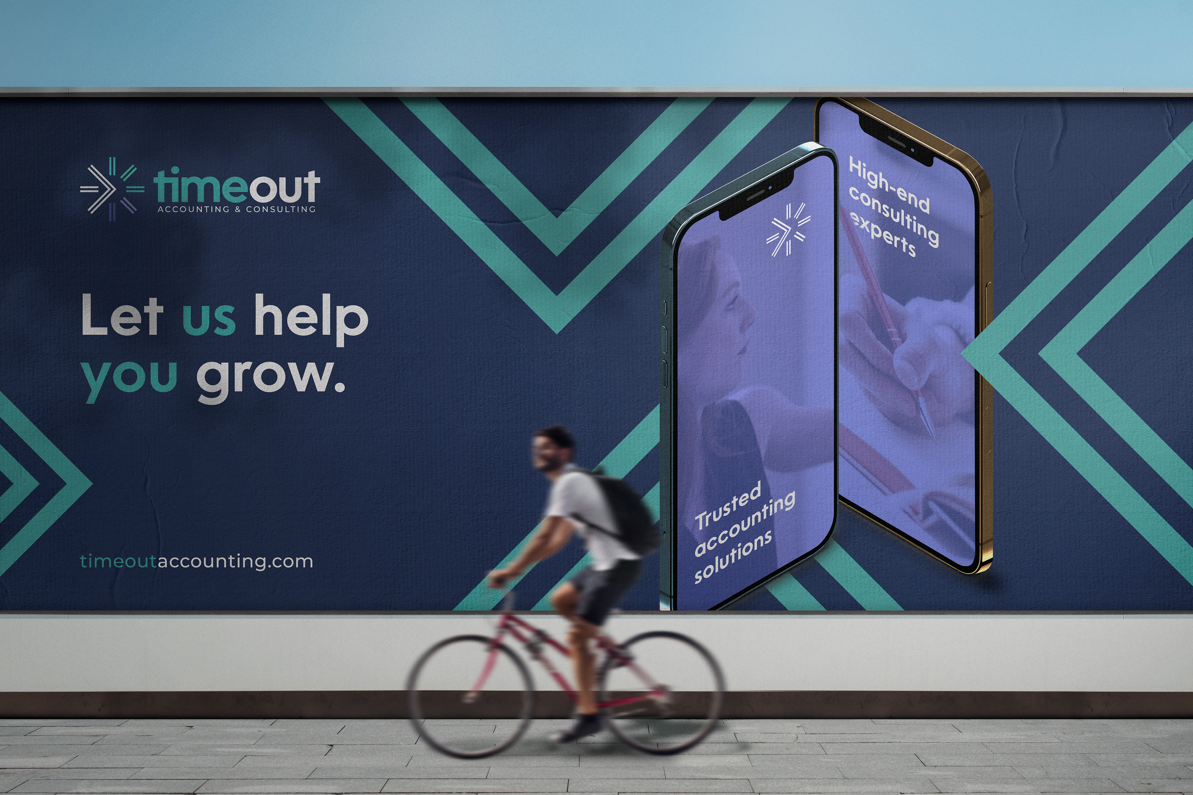
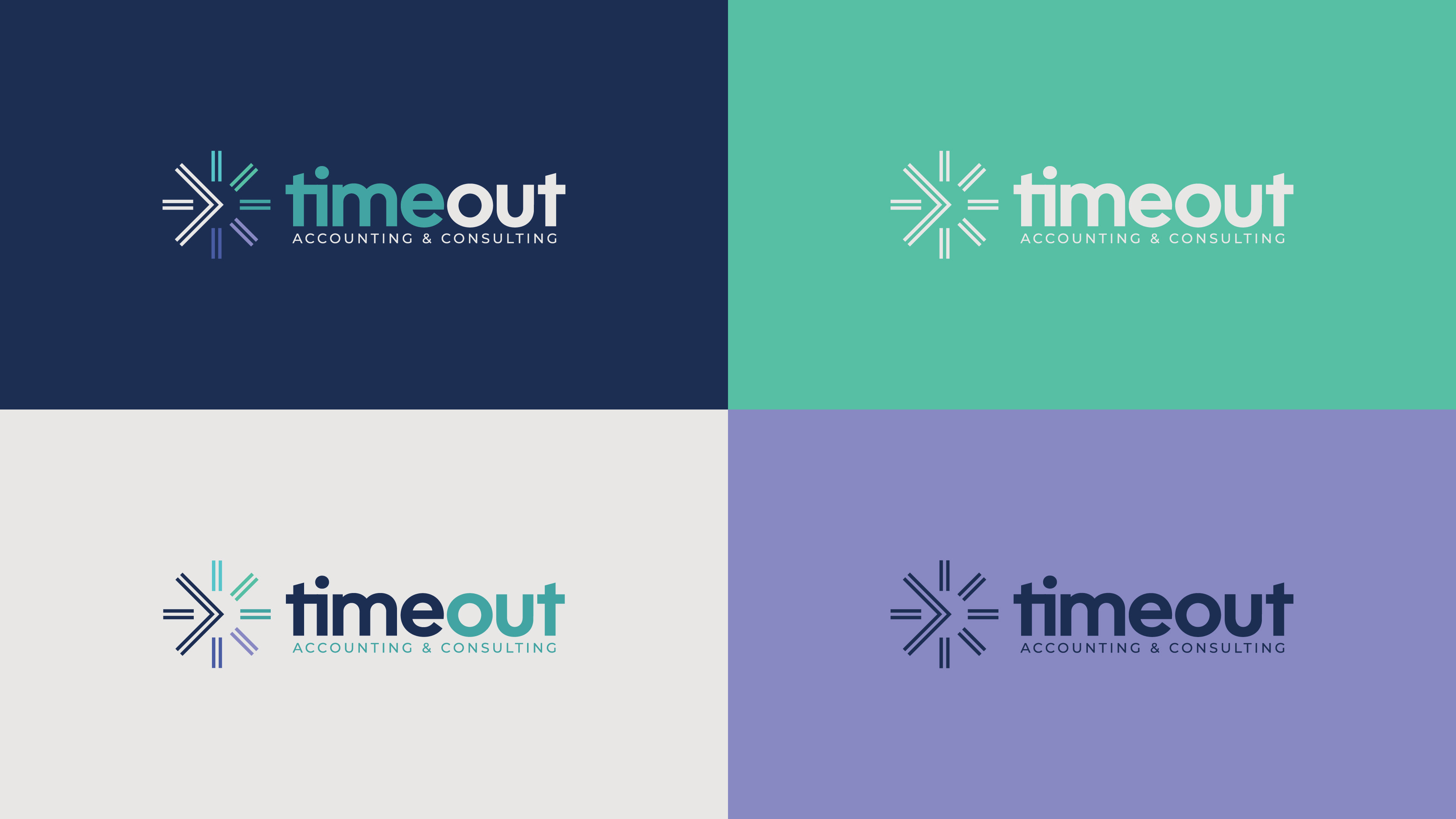
Time Out accounting & consulting approached me to design a new, modern logo to replace their current very outdated branding. Both the client and myself were very happy with outcome of the re-design. The business is based around bookeeping services as well as marketing, HR and managment consultation to help aspiring business owners to grow their companies. The logo needed to be unique and memorable, while at the same time leaning towards being a fun yet professional, corporate appearance.


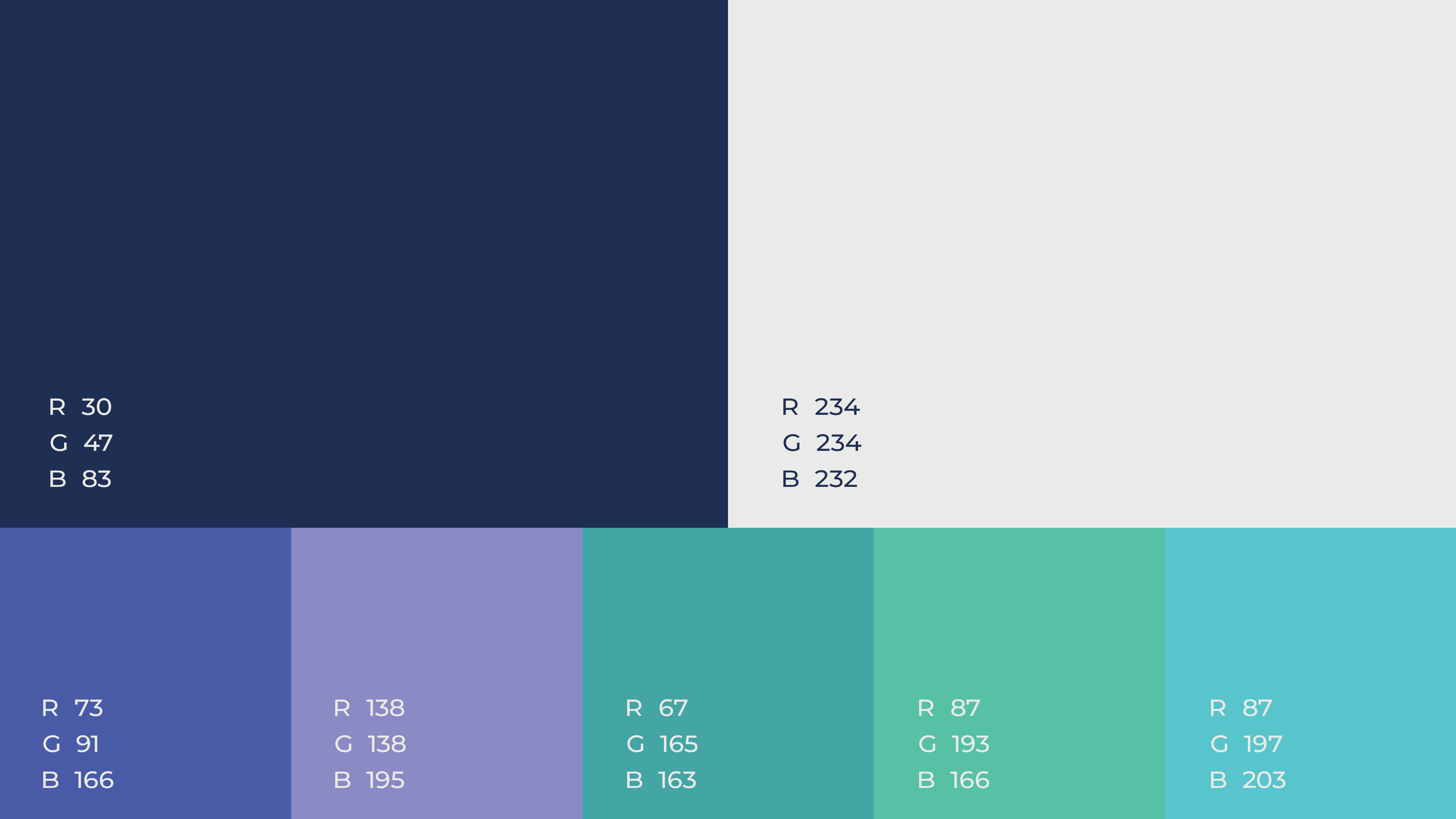
COLOUR PALETTE
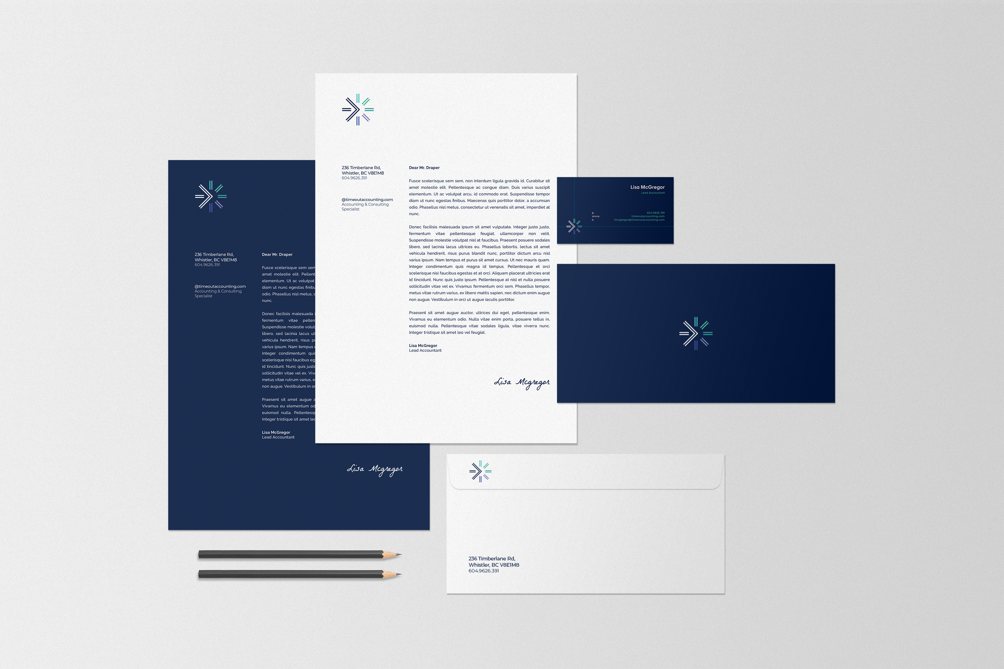
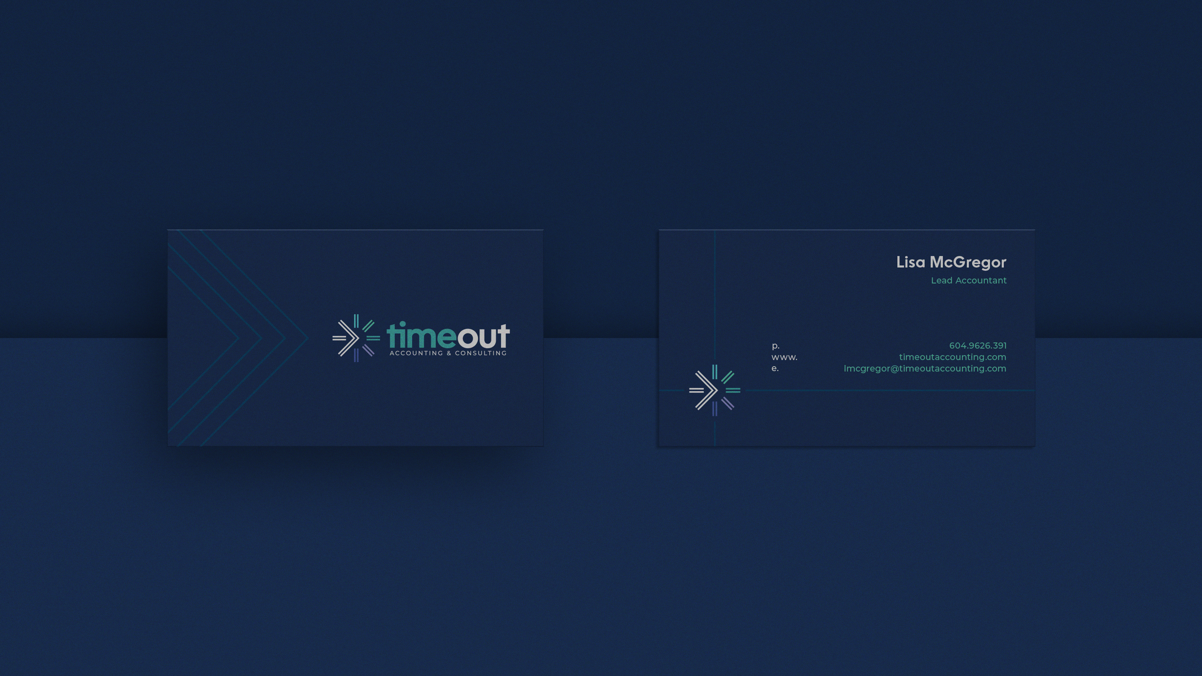
Colour psychology is hugely important for any logo or branding project. Each colour has specific connotations attached to it, and these connotations can induce certain emotions when people interact with colour. Considering Time Out Accounting & Consulting prides themselves on being a trusted provider of financial expertise to help clientele build confidence and success, a mix of blues and greens seemed like a great choice. This colour scheme plays into notions of prosperity, trust, confidence and success. Contrasted with an off-white, it brings the branding into the modern age whilst being conscious of professionalism.

LOGO CONSTRUCTION
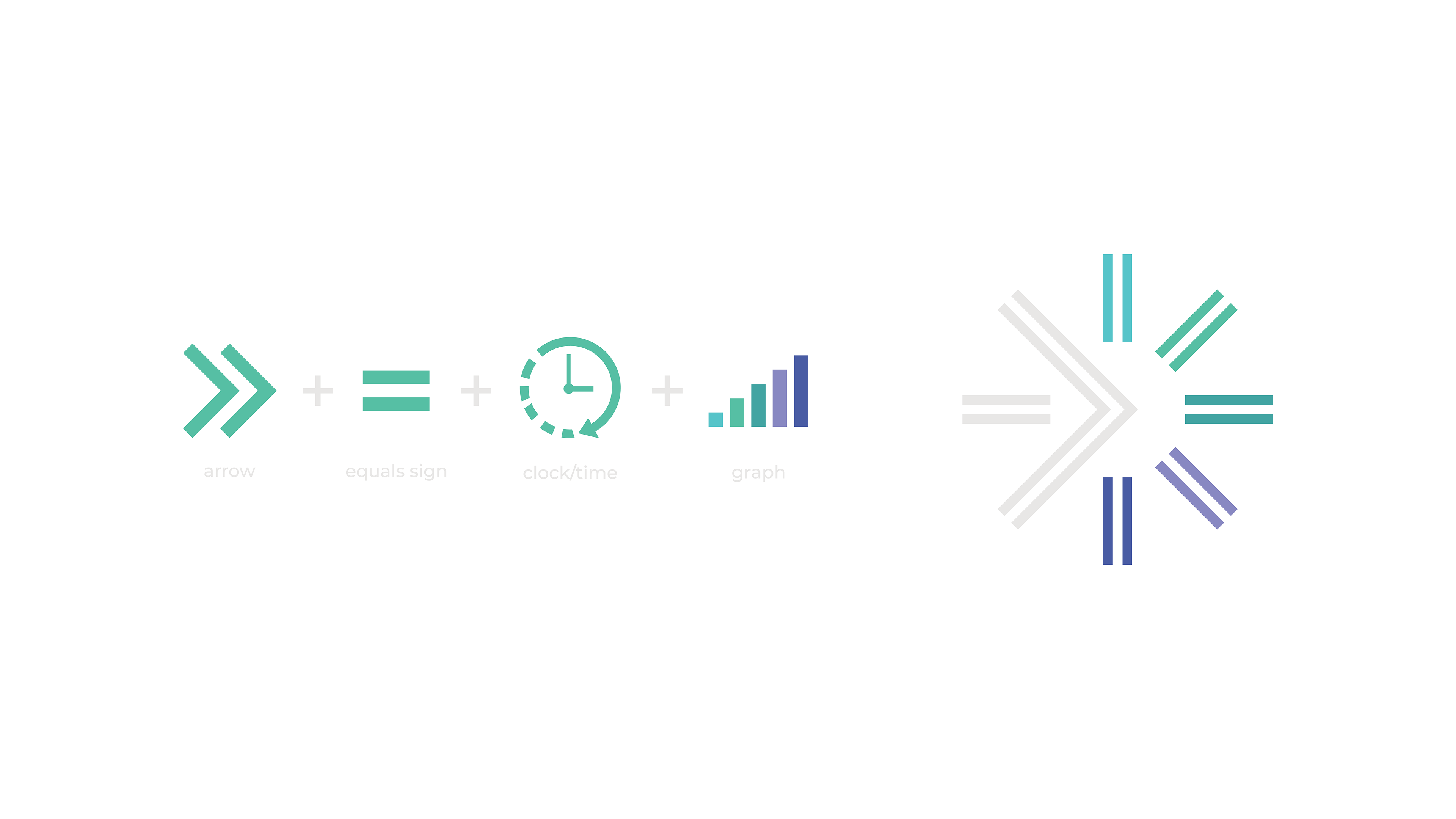
The logo construction involved implementing elements from the previous logo design, that being the clock & mathematical symbol, in a more succinct way. Combining this with the idea of an arrow and progress graph in both iconography and colour choice, I was able to form a unique logo mark that represented growth, progression and prosperity.
TYPOGRAPHY
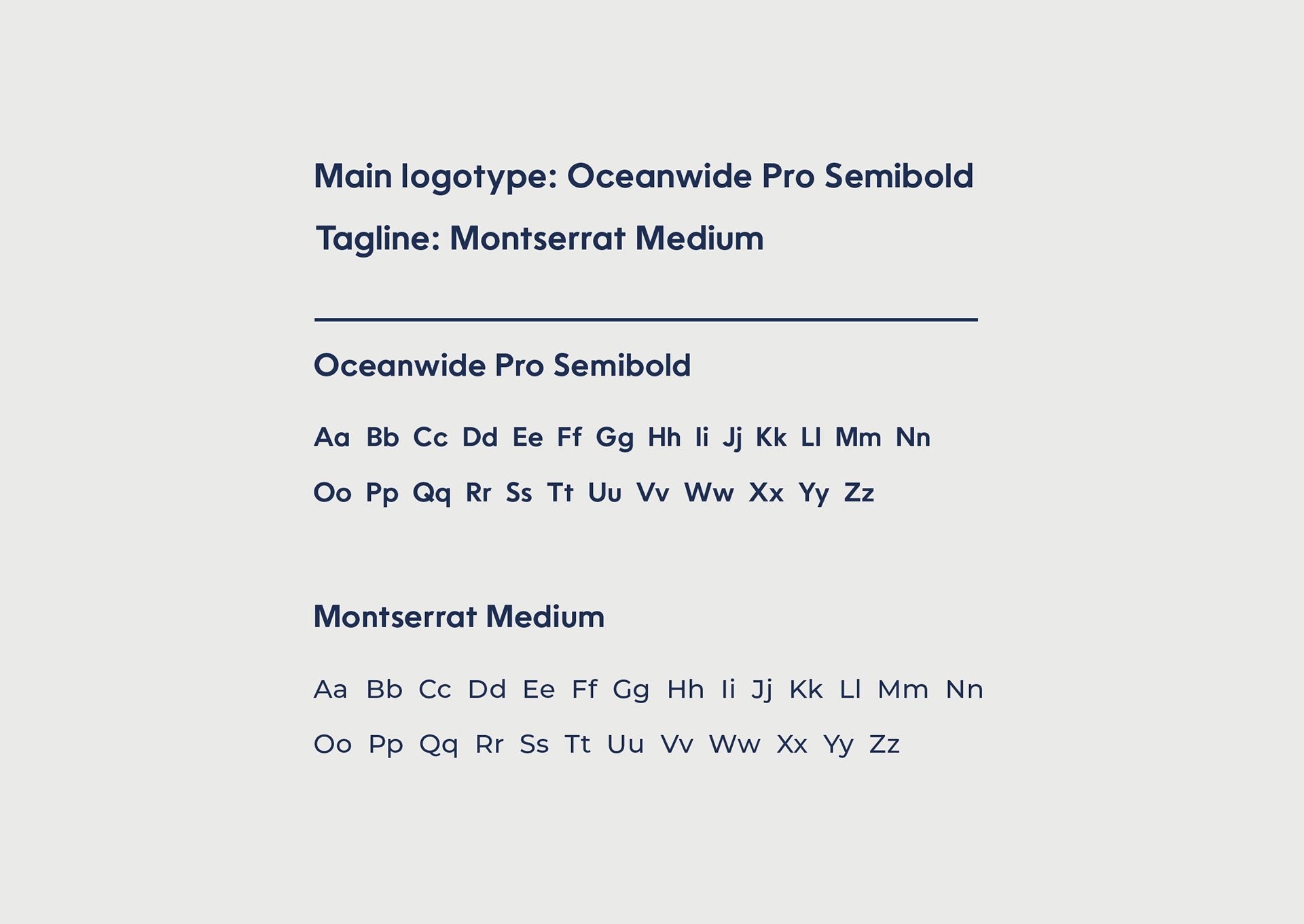
I chose sans serif typefaces for the logotype on this design, as the company was a new and modern presence in the financial world. I felt that a serif solution may come across as too dated for this project, and so a modern yet slightly playful sans serif was chosen at the request of the client.